The plan for the guest room started with some pillows I had made a year ago:
I originally made them for a guys' living room, so I tried to incorporate masculine elements like black leather and tie-fighter shapes.
Yeah, still my style more than theirs. I was really proud of the way I worked both dark blue and black into the same designs. These pillows became the color palette for the guest room.
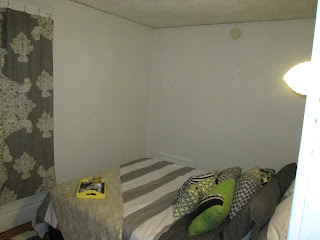
A friend at work donated a bed, and I set to work. At first I thought I wanted to match the pillows exactly, so I spent hours sewing a duvet. I hated it. Thankfully all the pieces had come from Goodwill, so it wasn't a big loss.
In my frustration I turned to the internet for inspiration, and finally caved and got a striped duvet from Target. It's not great quality, but I don't expect it to get a lot of heavy use.
(Yes, the bed is scooting around the room.)
I spent time on Pinterest and realized that I really love gray and yellow rooms. I still wanted to keep the black and white stripes I had been planning on, and I still wanted to incorporate the pillows. So I ended up with a big, flexible color palette.
Ideally the room is grayscale (black, gray, white) with pops of color (yellow, green, blue) and warm natural elements (wood, creams and tans, basket textures). I added the natural elements so the room wouldn't feel stark and cold. It is a resting place for guests, after all.
This end table was a Craigslist score at $20. I love the combination of black and natural wood, and I really like the open storage. The books were a gift from my mom--they pick up the colors of the room!
This table is meant for holding suitcases, and will eventually get a coat of white paint and gray stripes on top. The art is an original print by a Grand Rapids artist titled "Farmers Market." I buy a lot of my groceries at the farmers market in the summer, and frequently come home with lots and lots of sunflowers.
A tray holds extra toiletries and cups for the bathroom. I'm still figuring out what exactly I want on it.
This is the bed with a new headboard, frame, and bed skirt. I went with a navy bed skirt in hopes that it would bring out the dark blues in the pillow and rug. It was $4 at Goodwill. The headboard and frame are from Jubilee Furniture in IL, where I got my couches.
I chose to put the head on the inside wall for a few reasons. When placed like the first picture (with the handmade duvet) the bed takes up almost the whole room and any area left is used as walking space. With the bed turned I can still have a walkway on each side but the bed doesn't jut out as far.
I had liked the bed against the window wall, but the headboard overlapped with the window frame and was too chaotic visually. This way the bed is distinct, and you can turn the light off without getting out from under the covers.
Isn't that friendly? I hope it's not too feminine, since my dad and brother both have to stay in it.
Just some cute Goodwill finds on a Craigslist table ($10 total)
You've probably noticed that the rug is positioned oddly. I didn't want it to overwhelm the room, and I wanted people to be able to step out onto it on both sides. My solution was to lay it sideways under the lower half of the bed.
Now I just have to tackle those boring walls! Don't worry--there's a plan.
What factors did you have to consider in setting up your guest room?


Supper cute and creative!
ReplyDeleteThanks!
Delete